> ## Documentation Index
> Fetch the complete documentation index at: https://docs.typebot.com/llms.txt
> Use this file to discover all available pages before exploring further.
# Theme
export const LoomVideo = ({id}) =>
;
The theme tab allows you to customize the look of your typebot.
## Global
This section allows you to enable or disable the typebot branding, change the font and the background of your bot.
Toggling the **Typebot branding** option (or any other theme change) only
affects the live bot once you [republish](./../editor/publish) it. If you have
just disabled the branding but still see it on your published bot, hit the
**Publish** button to propagate the change.
### Progress Bar
The Progress Bar allows you to visually indicate a user’s progress through the bot. This helps improve user experience by providing a sense of advancement and completion.
To enable the progress bar in your chatbot:
1. Navigate to the Theme tab of your typebot.
2. Locate the Progress Bar option in the Global section.
3. Toggle the `Enable progress bar` switch to activate it.
| Option | Description |
| -------------------------- | ------------------------------------------------------------------------------------------ |
| **Placement** | Determines where the bar appears. Options: `Top` or `Bottom`. |
| **Background color** | Sets the color of the bar’s background. |
| **Color** | Sets the color of the progress indicator. |
| **Thickness** | Controls the height of the bar in pixels. Default: `4`. |
| **Position when embedded** | Controls how the bar is positioned when the bot is embedded on another website. See below. |
#### Position When Embedded
Use this option to adjust how the progress bar behaves when Typebot is embedded in a webpage:
* `fixed`: Pins the progress bar to the top of the window. It stays visible even if the chat container scrolls.
* `absolute`: Positions the progress bar at the top of the embedded chat container. It scrolls with the chat.
## Chat
This section allows you to customize all the chats components (avatars, bubbles, inputs etc...).
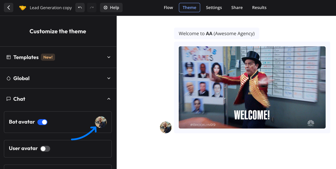
Click on the bot avatar to change the image:
 ## Custom CSS
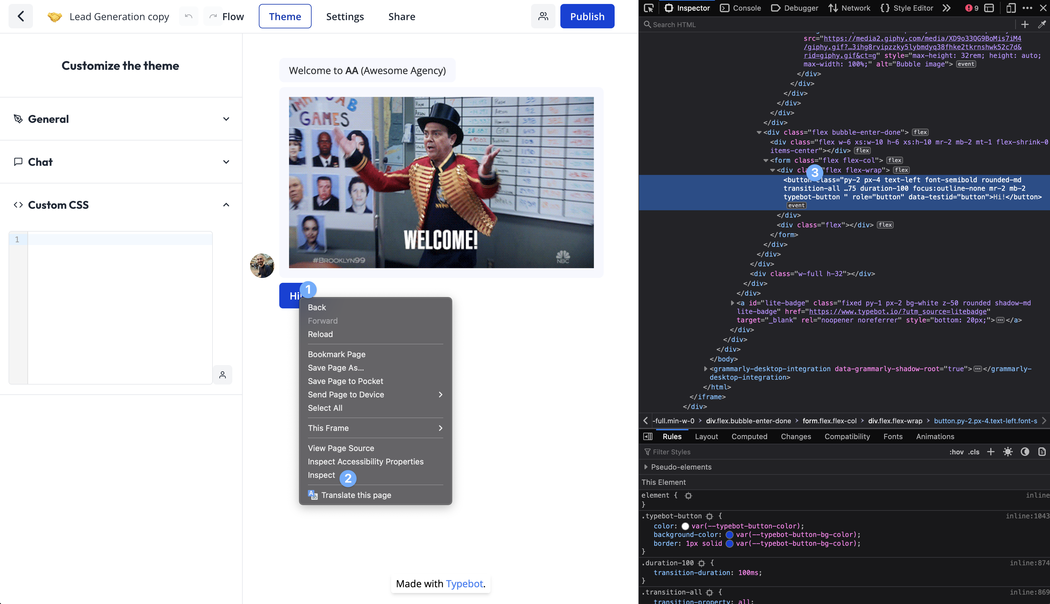
You can also decide to customize even further by adding any custom CSS you want. For this you right-click on the bot in the Theme page and inspect the element you want to customize:
## Custom CSS
You can also decide to customize even further by adding any custom CSS you want. For this you right-click on the bot in the Theme page and inspect the element you want to customize:
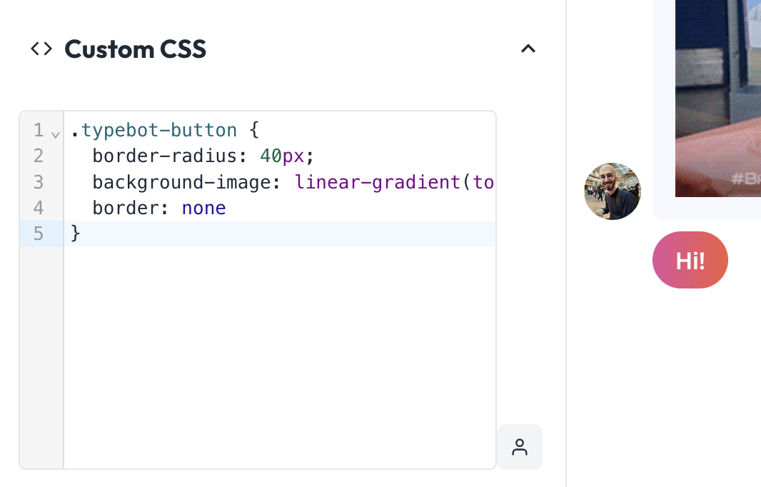
 For example, if I want my buttons to be more rounded, and have a fancy gradient color, I can add this to the custom CSS:
```css theme={null}
.typebot-button {
border-radius: 40px;
background-image: linear-gradient(to right, #e052a0, #f15c41);
border: none;
}
```
For example, if I want my buttons to be more rounded, and have a fancy gradient color, I can add this to the custom CSS:
```css theme={null}
.typebot-button {
border-radius: 40px;
background-image: linear-gradient(to right, #e052a0, #f15c41);
border: none;
}
```
 ### Customize a single button color
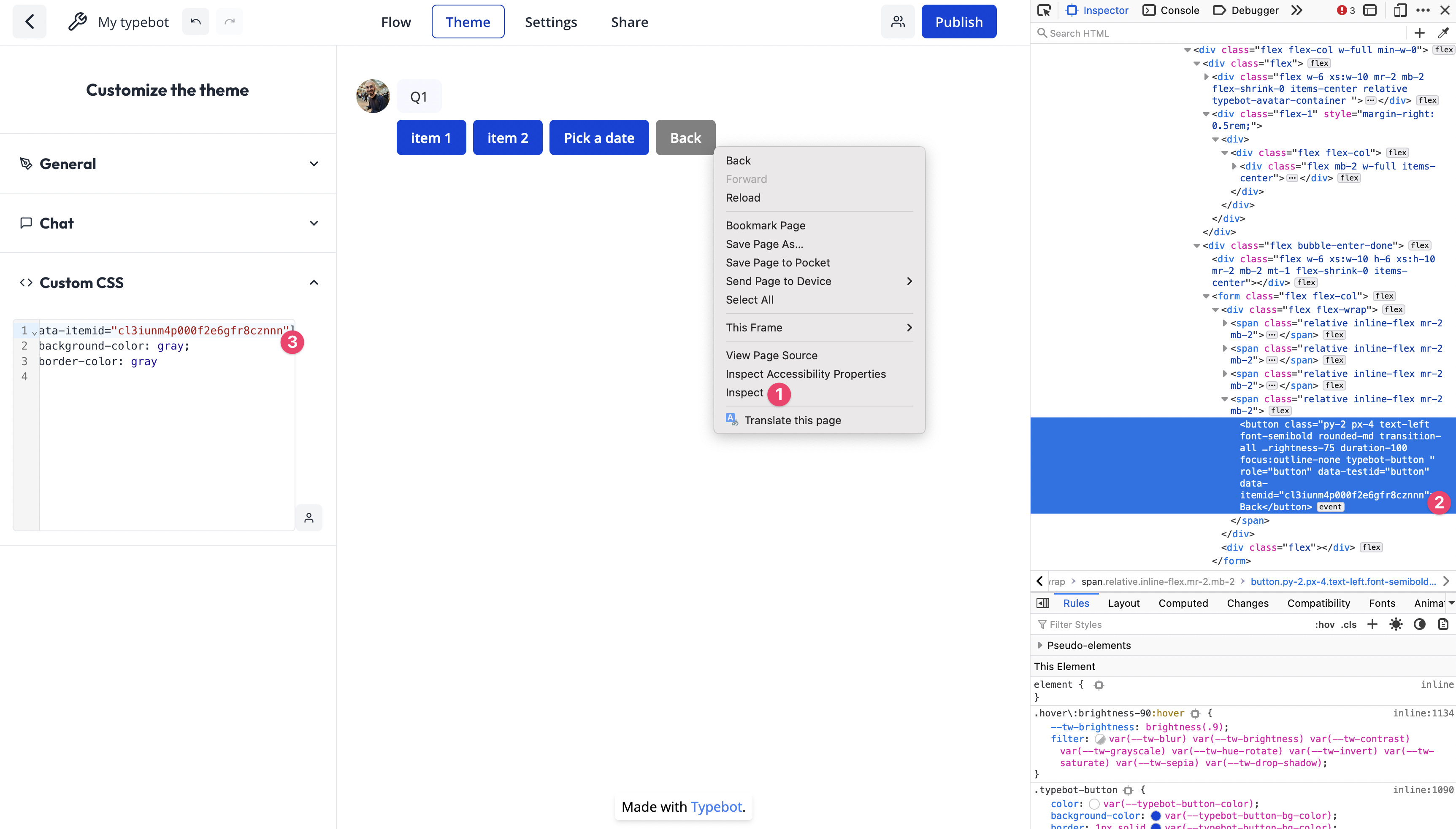
Thanks to custom CSS, you can customize the color of a single button for example by using the `data-itemid` attribute:
```css theme={null}
[data-itemid="cl3iunm4p000f2e6gfr8cznnn"] {
background-color: gray;
border-color: gray;
}
```
To find the item ID of a button, right-click on the button and inspect the element:
### Customize a single button color
Thanks to custom CSS, you can customize the color of a single button for example by using the `data-itemid` attribute:
```css theme={null}
[data-itemid="cl3iunm4p000f2e6gfr8cznnn"] {
background-color: gray;
border-color: gray;
}
```
To find the item ID of a button, right-click on the button and inspect the element: